Inspired artist
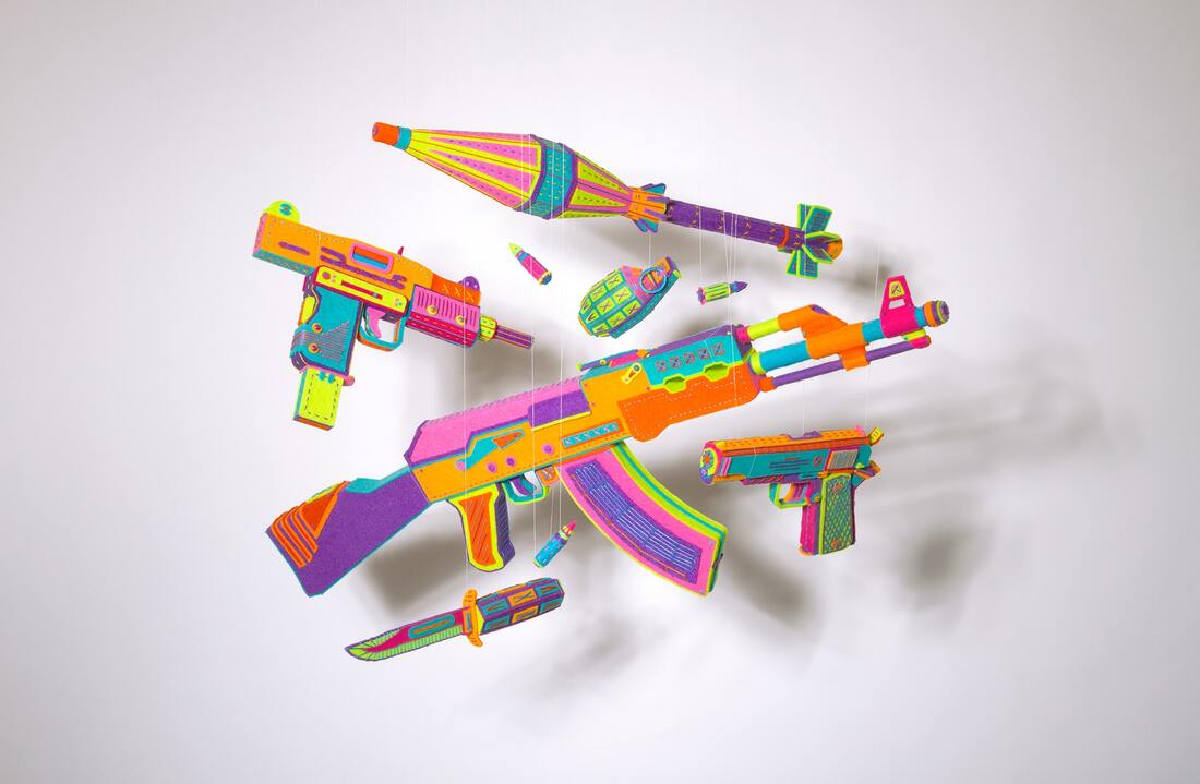
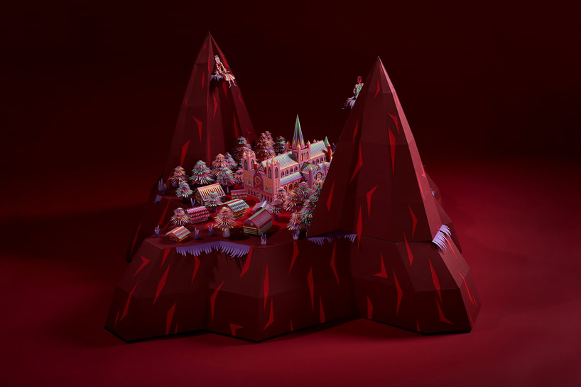
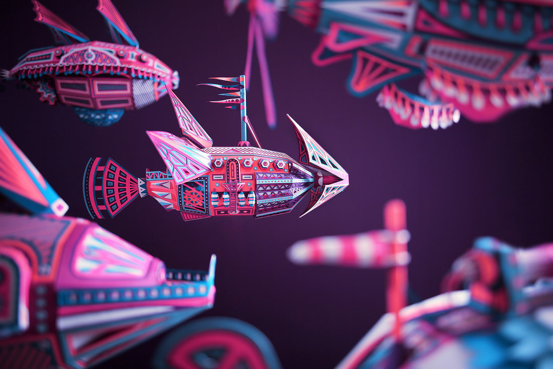
The french artist duo Zim&Zou are based in the city of Dordogne. The duo is composed of Lucie Thomas and Thibault Zimmerman. Both Lucie Thomas And Thibault Zimmerman studied graphic design for three years, but decided to stray away from computer design. They work with paper, string, and wood, but their favorite material is paper as shown in their art work. The artist duo have won an Illustrative award and an ADC Young Guns Award. Zim&Zou's pieces are a symbol of skill and dedication to their craft. The intricacy and the attention to detail in their work is something I admire. Their pieces show that they are passionate about what they do, because of the quality of their pieces. Zim&Zou's craftsman ship and dedication is what inspires me.
Their Website:
Their Website:
Drawing project
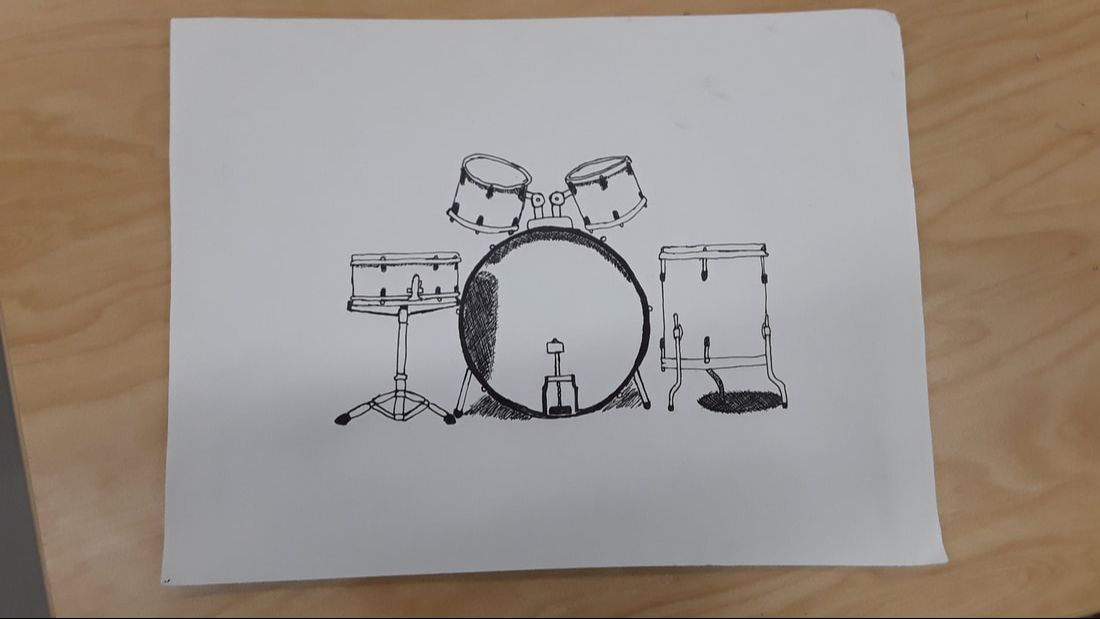
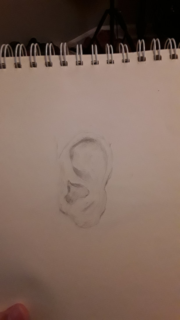
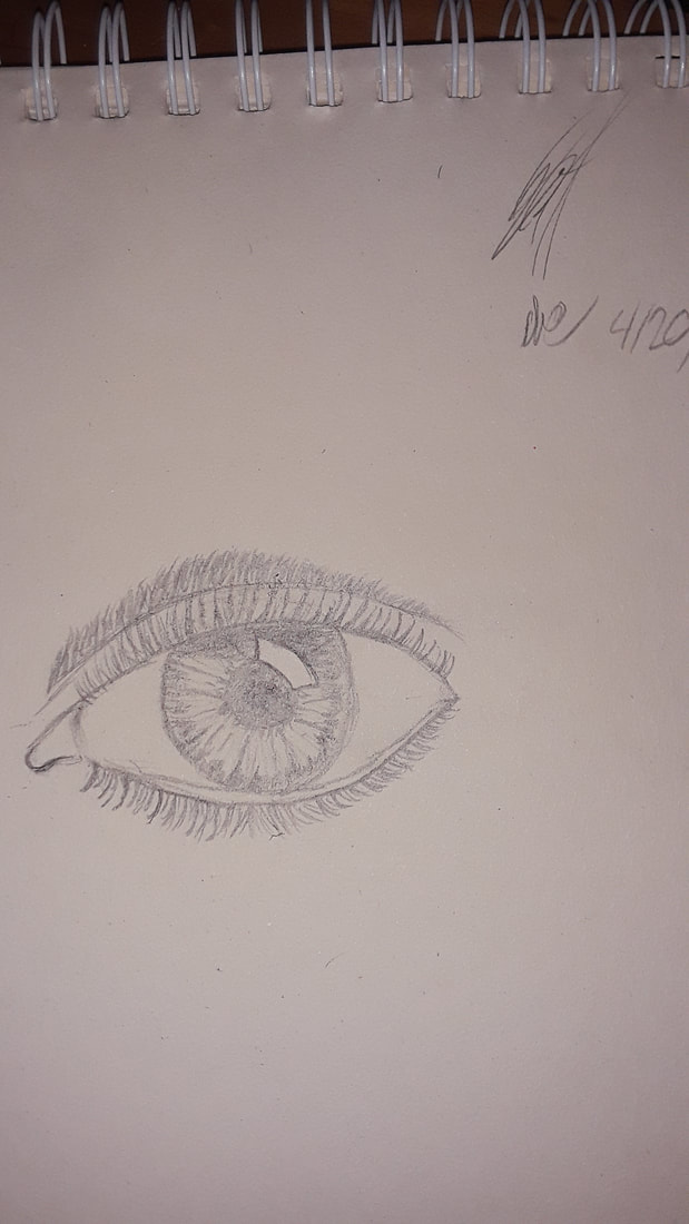
Pen Drawing
Title:Whole Kit
Title:Whole Kit
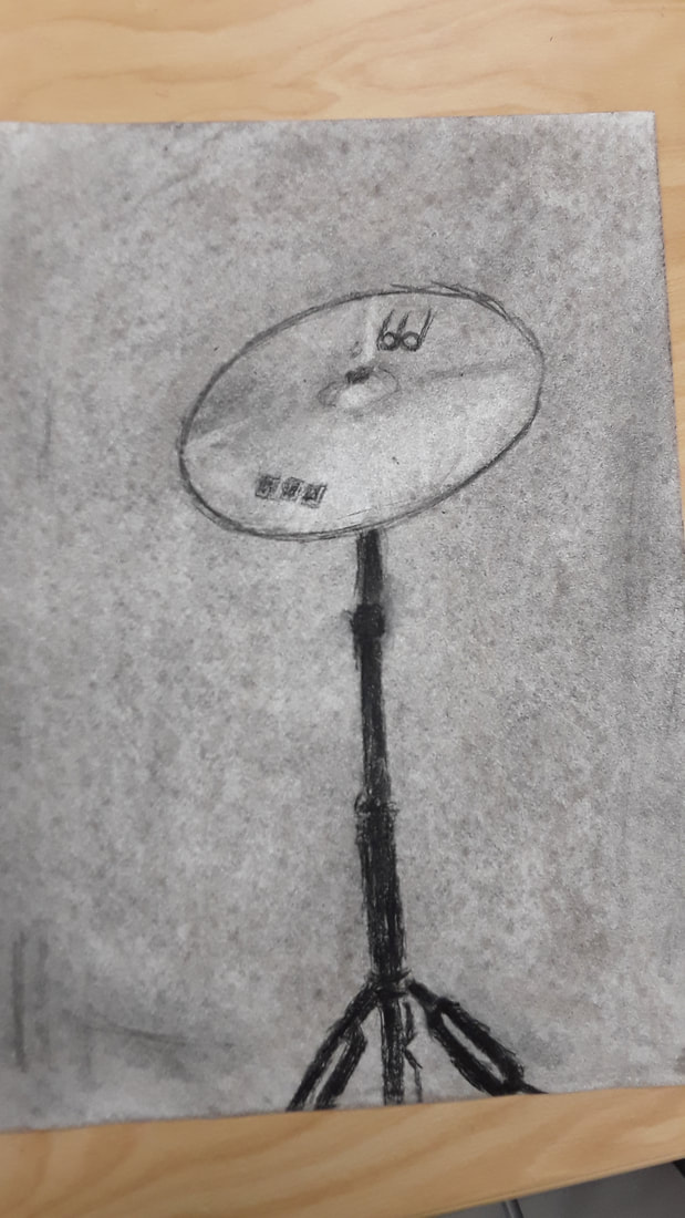
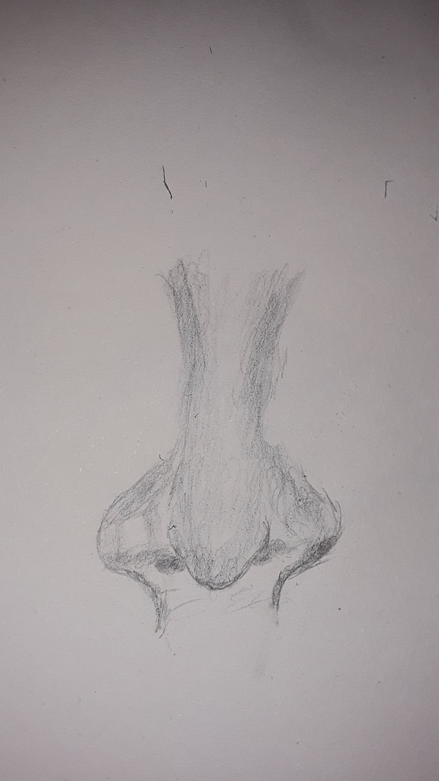
Charcoal Drawing
Title: Crash
Title: Crash
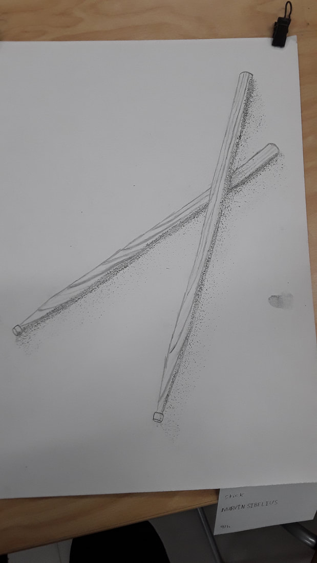
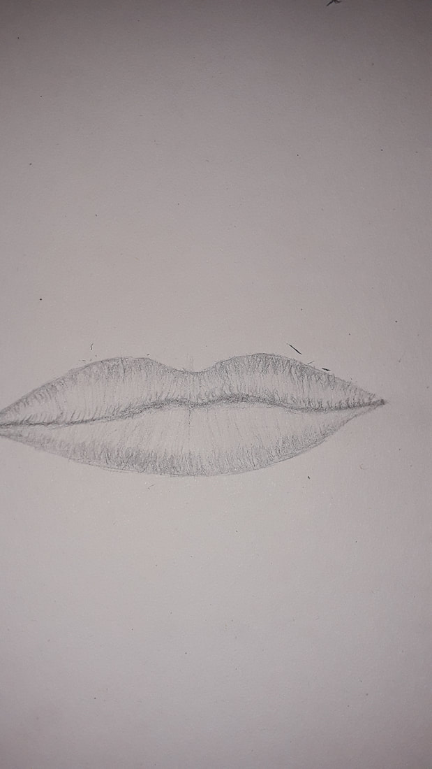
Pencil Drawing
Title: Sticks
Title: Sticks
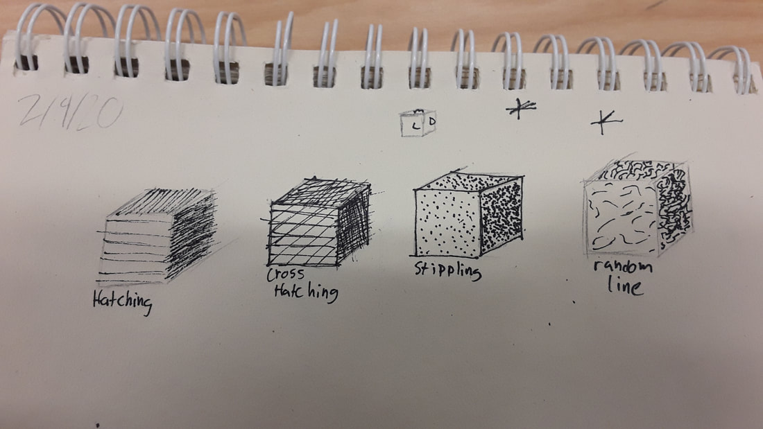
I found that the pen cubes were the most helpful warm up, because it gave me a better understanding of how shading works with different techniques. It helped me understand that shadows level of darkness can be changed by increasing or decreasing the space between lines.
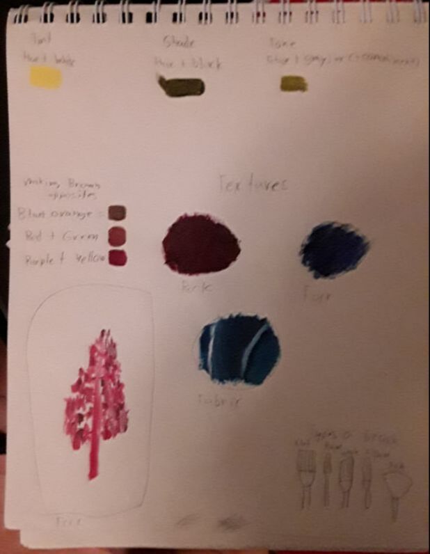
Value: The elements of design that define the lights and darks in artwork
Composition: the arrangement or placement of visual elements in a work of art.
Pros charcoal:
-Easy to blend and make gradients
-Shading and values are easier to make
- mistakes can be erased easier
Cons charcoal:
- easy to smudge your drawing
- Messy to work with
Pros Pencil:
-Easier to make small and more precise details
-Erasable
Cons Pencil:
-Easy to smudge
-you have to sharpen regularly
Pros Pen:
-Permanence
-cant smudge after your done
Cons Pen:
-Have to start with a pencil drawing first
-Because of its permanence you cant erase mistakes
The idea of place
|
|
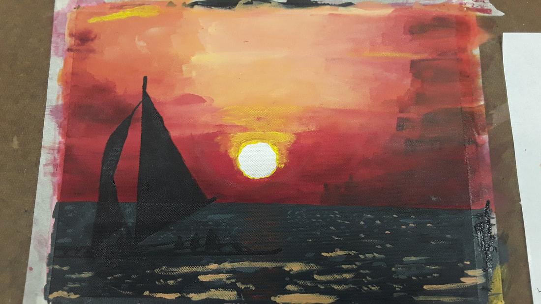
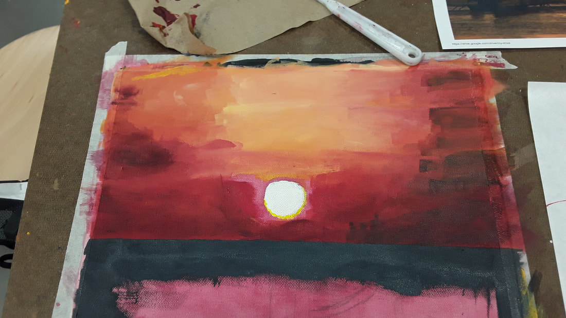
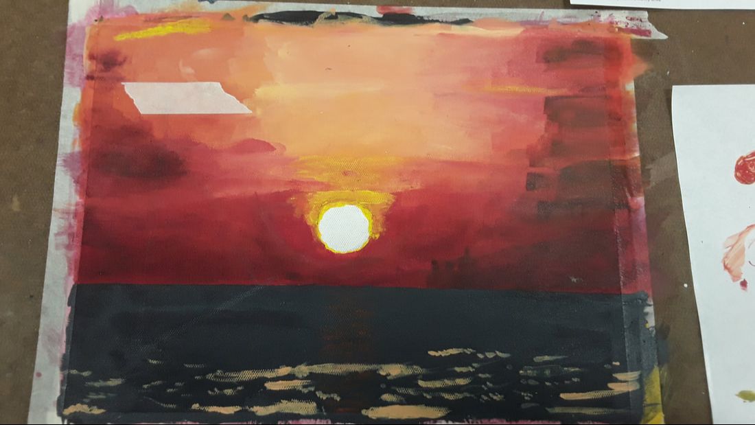
In my piece the the beaches of Boracay is represented. This isn't a beach i've been to, but when i was younger the beach was a very important place. Its where my family went for vacations, its where I had lots of fun spending time with family, eating food, having fun in the water, and getting scared by sea weed. The beach is a place that reminds me of the fun I had when I was younger, a time where I didn't have anything to worry about. While painting this piece i found it most difficult to show the light of the sun reflecting of the water and making a smooth gradient between the colors of the sunset. I feel I painted the sailboats silhouette successfully, but asides from that I feel everything else I did wasn't what I wanted it to look like.
I first started by taping the canvas paper to clipboard and clipping my reference image on it as well. I then set down a layer of primer by water down red paint and putting it all over the canvas. After letting it dry I mixed all the colors I needed for the sunset and started by using a white orange on the center and I attempted to make a gradient between the sides of the painting. I did this while decreasing the amount of white orange in the middle as I went down the canvas and stopped once I covered about 3/4 of the canvas. I then painted the sun in and put a thin yellow crescent on it and used a watered down yellow and painted above the sun to show the light coming of the sun. After that I took a watered down reddish black and went over the sides of painting and after letting it dry I took masking tape and taped off the 1/4 of the bottom of the canvas. I mixed a gray that had more black than white and painted a base layer of grey. I mixed the rest of my colors a light orange, a lighter gray and a dark orange. using the the tip of a small flat head brush I poked very lightly using my dark orange while aligned with the sun. I then took my light grey and orange and did the same thing until I got to the bottom of the page where I used strokes instead. Finally I traced out the silhouette of the boat and I painted over it using black.
I first started by taping the canvas paper to clipboard and clipping my reference image on it as well. I then set down a layer of primer by water down red paint and putting it all over the canvas. After letting it dry I mixed all the colors I needed for the sunset and started by using a white orange on the center and I attempted to make a gradient between the sides of the painting. I did this while decreasing the amount of white orange in the middle as I went down the canvas and stopped once I covered about 3/4 of the canvas. I then painted the sun in and put a thin yellow crescent on it and used a watered down yellow and painted above the sun to show the light coming of the sun. After that I took a watered down reddish black and went over the sides of painting and after letting it dry I took masking tape and taped off the 1/4 of the bottom of the canvas. I mixed a gray that had more black than white and painted a base layer of grey. I mixed the rest of my colors a light orange, a lighter gray and a dark orange. using the the tip of a small flat head brush I poked very lightly using my dark orange while aligned with the sun. I then took my light grey and orange and did the same thing until I got to the bottom of the page where I used strokes instead. Finally I traced out the silhouette of the boat and I painted over it using black.
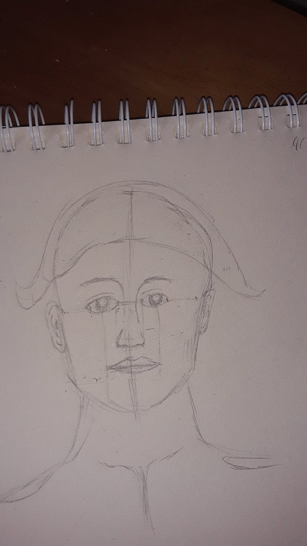
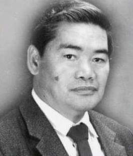
Portrait Drawing unit project
|
|
|
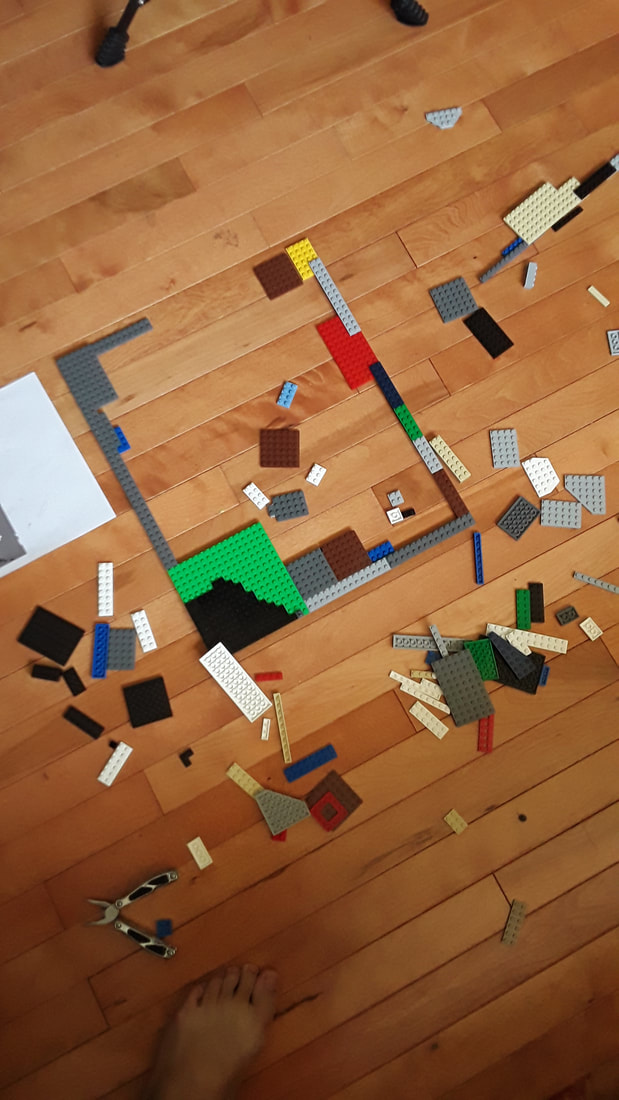
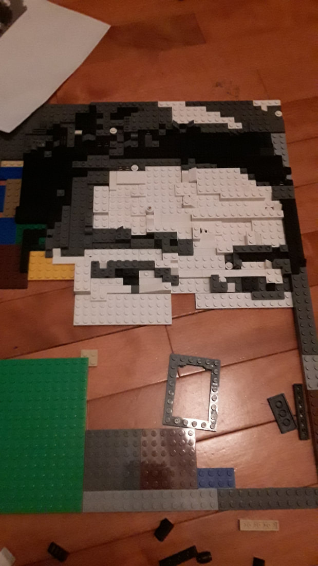
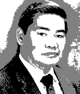
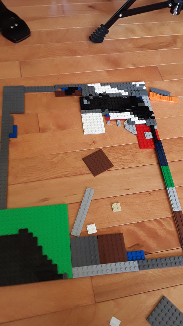
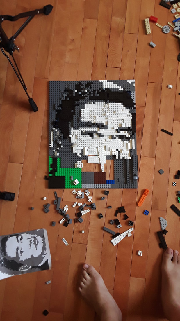
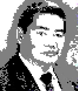
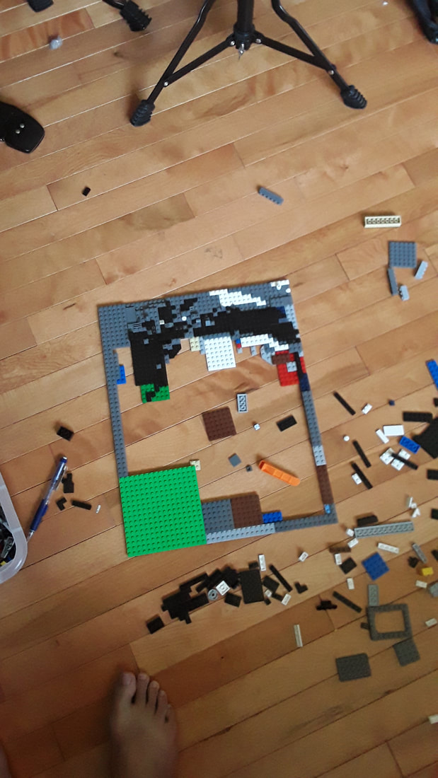
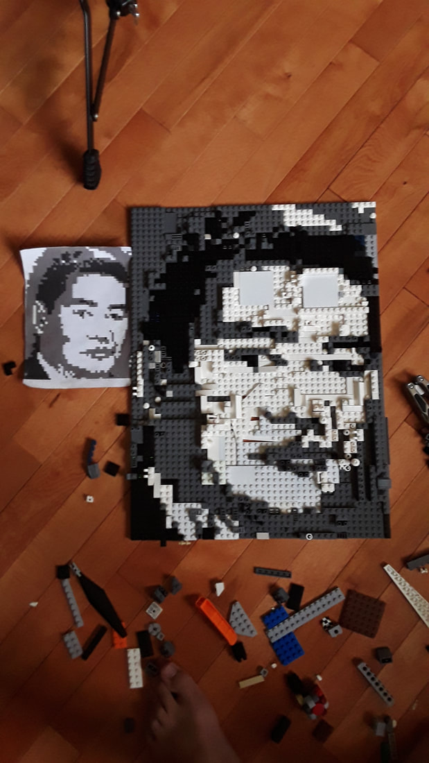
This portrait of my Grandpa was made using only black, white, and dark grey Lego pieces and is about 18 inches long by 12 inches wide. I first started the piece by posterizing the image to minimize the amount of colors in the image since I dont have that many Lego pieces of different shades of gray and black. After that I pixelized the image, printed it out, and started working on the actual piece itself. I started out by building the frame for the entire piece, after that I started to place pieces in the top right corner of the portrait. I then started to work towards the left side of the portrait and eventually just went down the piece row by row. At some point when I was building the portrait I run out of white pieces and had to take some other Lego pieces and sand and paint them. After waiting a few hours I had the white pieces I needed and was able to finally complete the portrait. This piece took me 3 days to plan and finish.
|
|
|
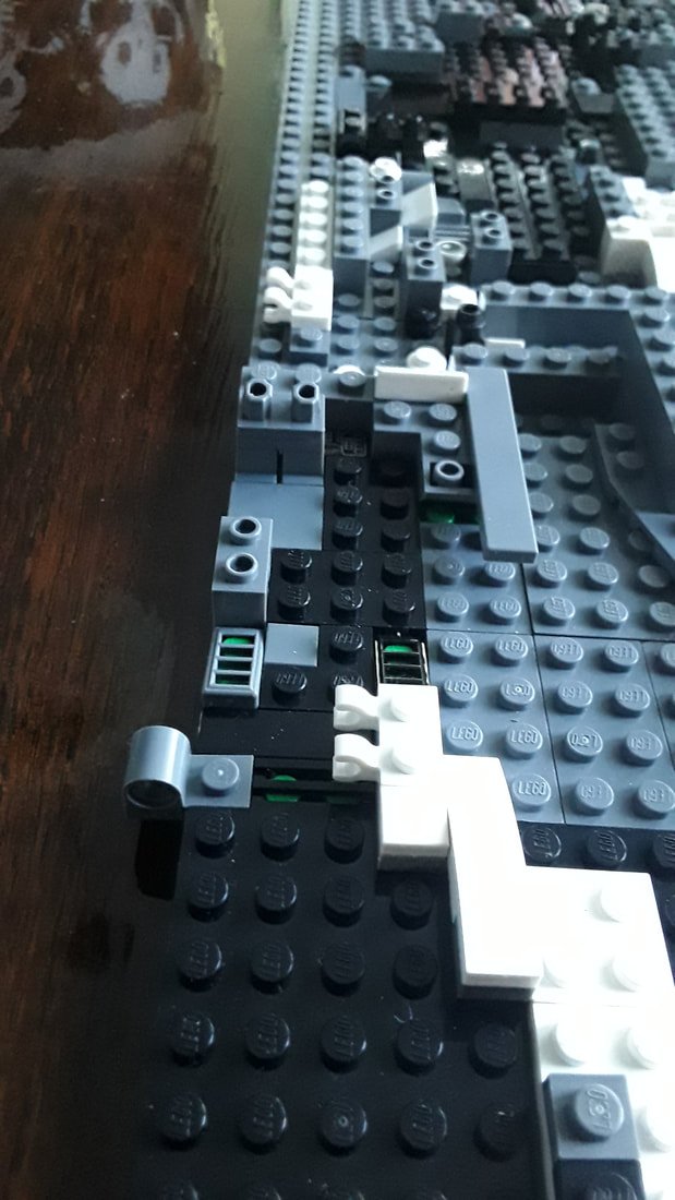
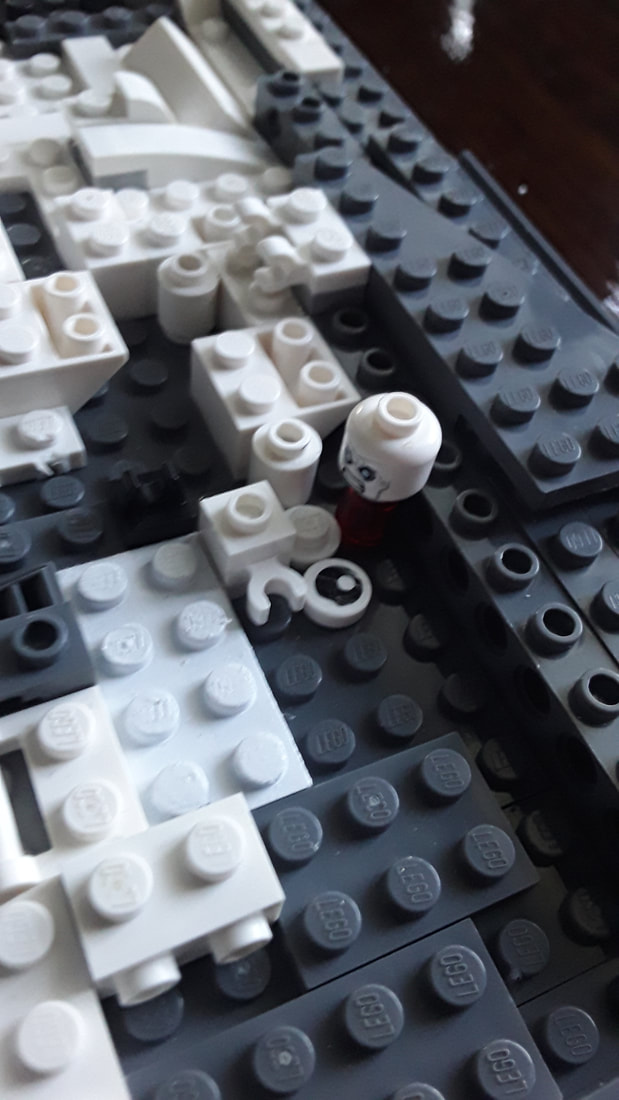
The texture of this piece differs in different areas in some parts, some pieces here are studded ,some are smooth, and some are pieces are elevated higher than other pieces. The pieces color is limited only to white, black and grey. The variety in the piece is shown through the different textures and elevations of different pieces with smooth Lego pieces placed next to studded pieces and some pieces being higher than other pieces as well as the different pieces used like the bottom half of Lego people and heads of Lego people as shown below.
|
|
I always liked playing with legos and had multiple sets when I was around the age of 7, so I thought that I should do a portrait made of legos. I decided that the subject of the piece would be my grandpa who I was very close with and he brought me a lot of happiness and fun, and would do little things for me and my siblings, like buying us snacks for us every now and then, and putting money in some of our Easter eggs. Legos as well provided me with happiness and fun, every time I got a new set I would spend hours building the set and playing with it and then disassemble it and mix the pieces with other sets and play with the new thing I built. I feel like I express that in my piece through the use of legos.
I feel like I did a good job matching up the pixelated version of the image. I learned that I should make sure that I have enough resources and the right resources for the project before I do the project.
I feel like I did a good job matching up the pixelated version of the image. I learned that I should make sure that I have enough resources and the right resources for the project before I do the project.
Photo in time
WARM UP
|
|
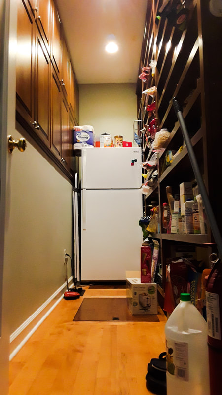
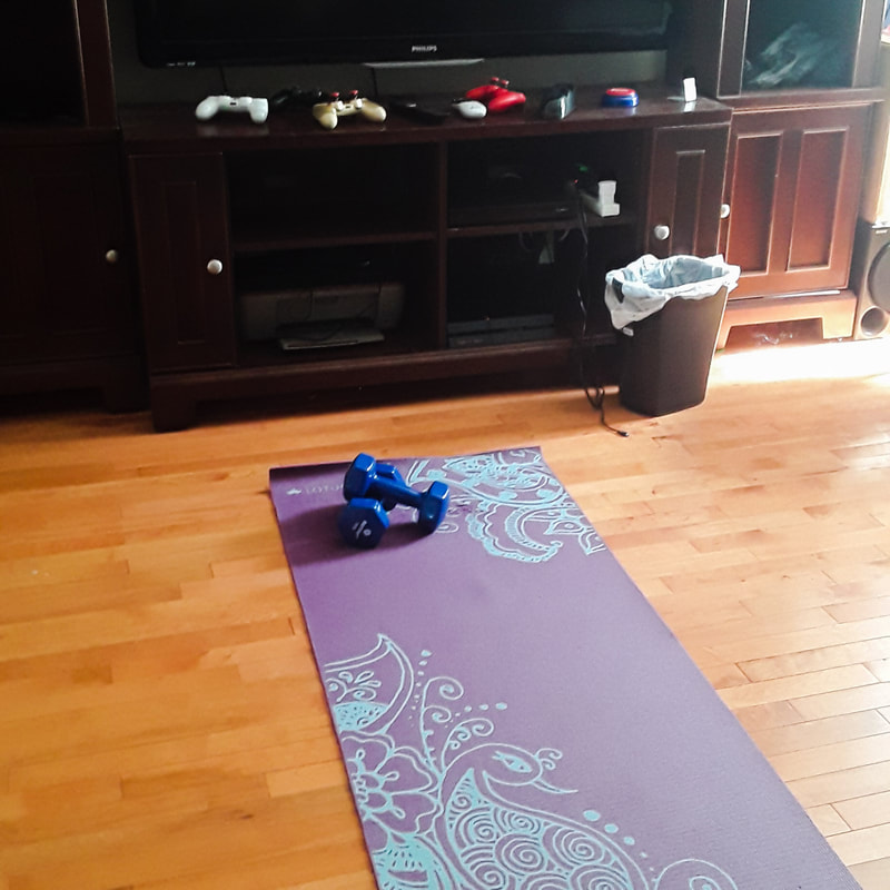
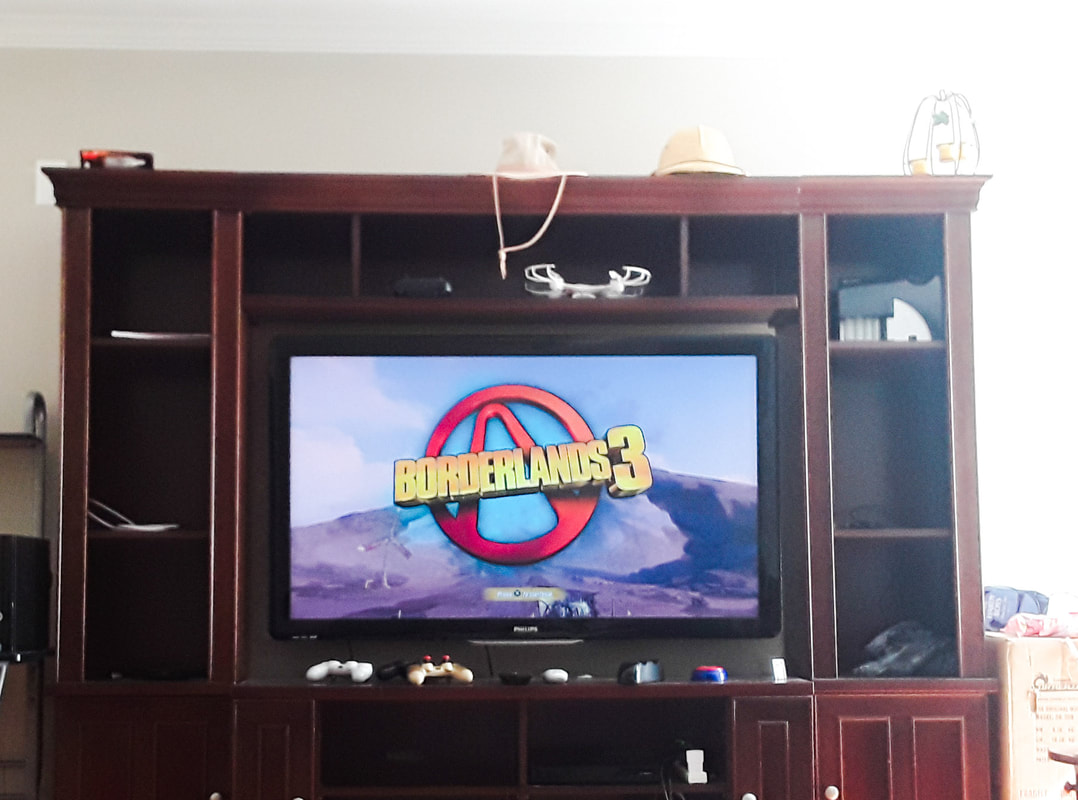
In all these photos I show my experience in this quarantine the 1st photo is of a weights and a workout mat since quarantine has started I've been exercising to make sure that I have some form of physical activity and to keep myself occupied. The 2nd photo is of a game I like to play when I'm finished with all of my work for the week its been helping take care of my boredom during this quarantine. The 3rd photo is of my pantry I find myself walking into the pantry sometimes for snacks, sometimes to get something to cook and sometimes for no reason at all.
In these photos I used colors to show what I'm trying to do to stay positive during this time. I was inspired to do this piece to show what most people are doing to pass the time inside, learning to cook playing games, and working out are just some ways most of us are trying to do in these times. I find that succeeded in using editing to make the photos better and I learned that trying to find the best photo is very difficult.
In these photos I used colors to show what I'm trying to do to stay positive during this time. I was inspired to do this piece to show what most people are doing to pass the time inside, learning to cook playing games, and working out are just some ways most of us are trying to do in these times. I find that succeeded in using editing to make the photos better and I learned that trying to find the best photo is very difficult.
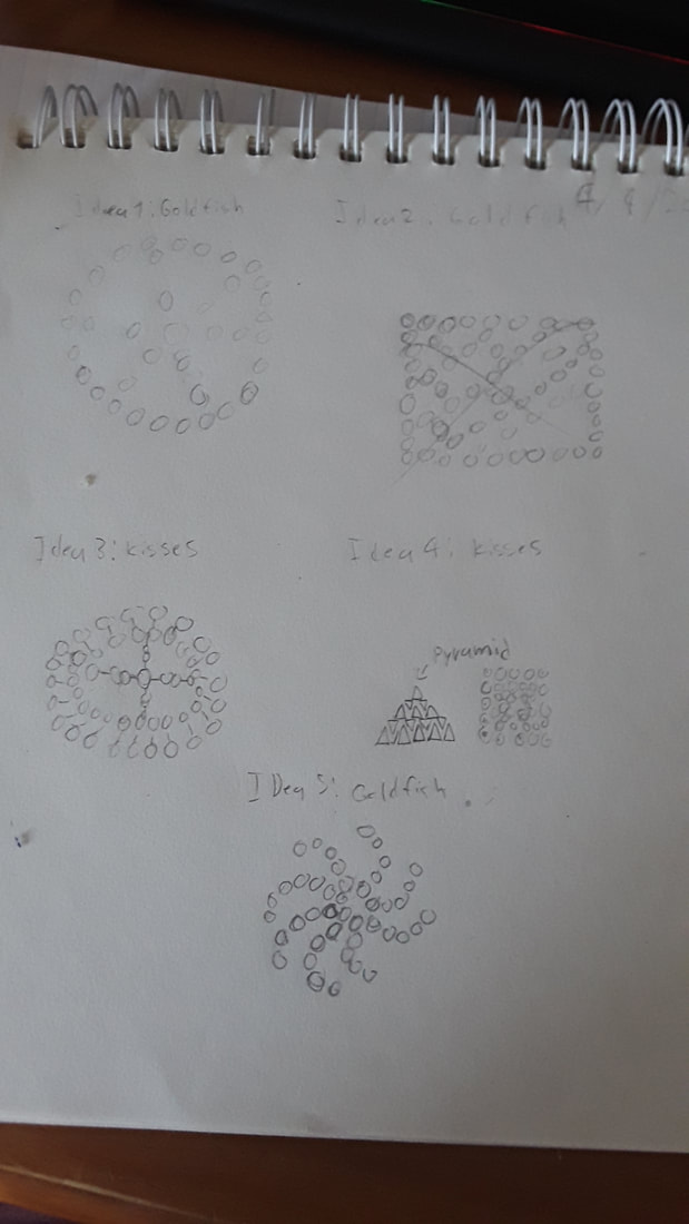
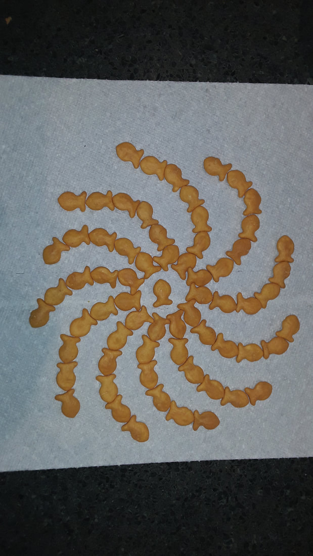
Object arrangement
|
|
This is my object arrangement using goldfish I tried to make multiple ideas that use the goldfishes shape to make symmetrical arrangements and I eventually ended up with this pattern of goldfish. The pattern is sort of a cyclone of goldfish with one central gold fish I tried my best to make it as symmetrical as possible and I feel like I did a god job.
I tried to make the background of the goldfish contrast the color of the gold fish so I used a white background and I learned that this project can seem easier to do as opposed to other projects, but it still requires a bit more effort than you would think it would have.
I tried to make the background of the goldfish contrast the color of the gold fish so I used a white background and I learned that this project can seem easier to do as opposed to other projects, but it still requires a bit more effort than you would think it would have.
